Francis
Francis is an FP&A platform built for finance teams that have outgrown spreadsheets, but not the way of thinking behind them. The refreshed identity builds on that same logic, preserving the familiar while giving Francis a clearer, more structured and more confident expression.


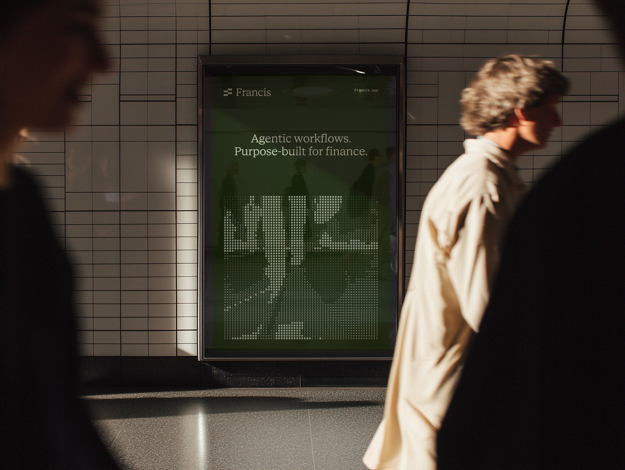

Francis is a financial planning platform built for modern finance teams that have outgrown spreadsheets, but not the way of thinking behind them. Bringing consolidation, budgeting, forecasting, reporting and business partnering into one connected environment, Francis builds on the flexibility, transparency and familiarity finance teams already trust. Our task was to create an identity that reflects the same philosophy: continuity, upgraded.
The visual identity takes direct inspiration from Excel. The updated symbol is a natural evolution of the original Francis logo, refining its existing logic into a more precise and digital expression. It begins with the equals sign, the starting point of every formula, while its modular construction forms an abstract ƒ, a subtle reference to functions and the logic behind spreadsheets. At the same time, the shape reads as an F for Francis and echoes the cells of a spreadsheet. The same logic carries into the grid, creating a visual system defined by structure, precision and clarity.
A supergraphic built from familiar spreadsheet characters such as =, +, / and # transforms the syntax of formulas and data into a more expressive digital language. It gives Francis a technical, product-led visual world rooted in the tools and behaviours of modern finance teams, while reinforcing the sense of structure that runs throughout the identity.
Green anchors the identity as a subtle reference to both spreadsheets and the language of finance, where positive performance is associated with growth and gain. Refined into muted moss tones, it gives the brand a calmer, more considered expression. The result is an identity that feels mature, dependable and distinctly Francis, built for finance teams that expect their tools to keep up.